The origin of "drejkim": Unveiling its meaning using CSS
22 July 2016
Introduction
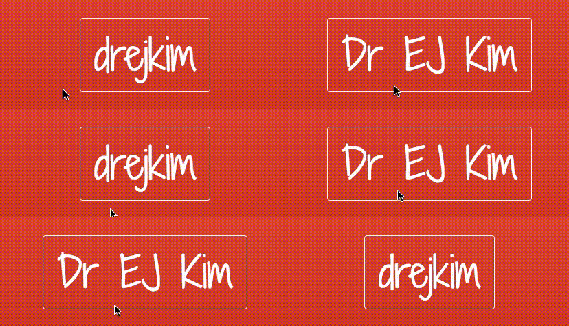
I often get asked about my handle, drejkim. What does it stand for? To address this question, I thought it would be fun to embed it as an easter egg on my home page. Were you able to find it? If not, here’s a closer look:

Using CSS to show / hide the easter egg
In order to create this effect, I used pure CSS… no JavaScript is necessary. This is made possible with the :hover selector, which is available for all elements, not just anchor tags.
To get a better understanding of how this works, let’s create a simple “Hello World” example that mimics the effect. When you mouse over the text “Hello”, the text “World” appears and “Hello” disappears. When you mouse out, “World” disappears and “Hello” reappears.
See it in action here:
See the Pen Show / hide on hover by Esther Kim (@estherjk) on CodePen.
HTML
The markup is straightforward. There are two h1 elements wrapped in a div element. The div element is styled with the .logo-container class. Each h1 element is given a unique ID.
<div class="logo-container">
  <h1 id="logo">Hello</h1>
  <h1 id="logo-easter-egg">World</h1>
</div>
CSS
.logo-container contains some basic styling for the logo, including a black border:
.logo-container {
  display: inline-block;
  padding: 20px;
  cursor: default;
  border: 1px solid black;
}
To apply a hover effect on our div element (the one styled with .logo-container), we can use the :hover selector. In our case, we want to hide #logo and display #logo-easter-egg. Since #logo and #logo-easter-egg are direct children of .logo-container, we can use the > combinator.
.logo-container:hover>#logo {
  display: none;
}

.logo-container:hover>#logo-easter-egg {
  display: inline-block;
}
To ensure that the easter egg is hidden by default, we should set its display attribute to none:
#logo-easter-egg {
  display: none;
}
Wrapping up
There you have it! By taking advantage of the CSS :hover selector, you can create your own easter eggs. And, I hope you now know what drejkim stands for too!
Categories: Web
comments powered by Disqus